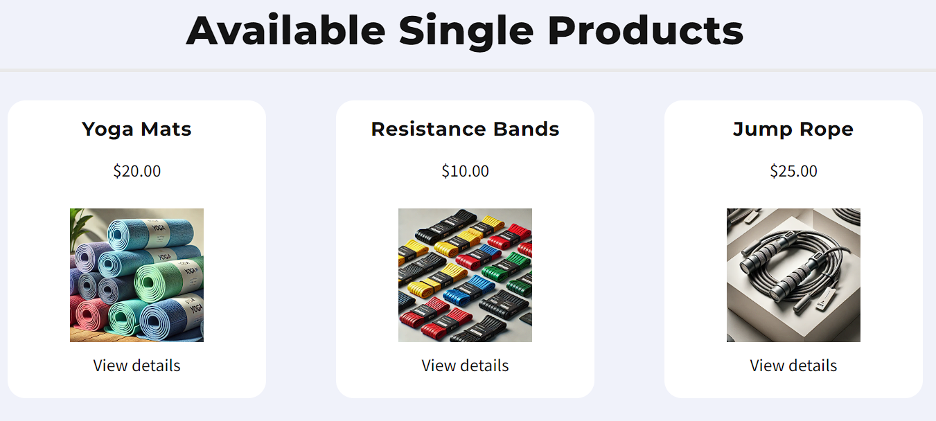
Displaying individual products on your ClickFunnels pages helps customers easily browse and purchase items. The products element you add is dynamic, automatically pulling details—like the name, image, and price—from the products you’ve created. This article explains how to add products element to your pages and customize their appearance for a better user experience.
Requirements
An active ClickFunnels account
Ensure that each product is set to be visible in the Online Store.
Adding The Products Element
Open the ClickFunnels page editor for the page where you want to display your products.
Click Add Element in the desired row to open the Elements menu.
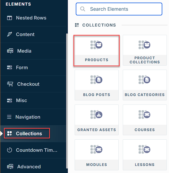
Scroll to the Collections section and select the Products element.
After adding the “Products” element, you will be prompted to select the number of columns you want to add inside the container.
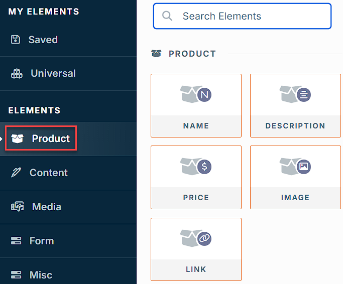
Add dynamic product details such as Name, Image, and Price, which automatically pull data from your product settings to keep your page updated. You can include the following elements:
Name: Displays the product name.
Description: Adds a brief description.
Price: Shows the product price.
Image: Displays the product image.
Link: Adds a button linking to the product page or checkout.
Click on each element to access its settings. Adjust fonts, colors, spacing, and layout to match your page’s design for a cohesive look.
Customizing Products Element
Accessing Settings
When you hover over a collection element, its border will be highlighted in magenta . To access an element's settings, click on the gear ⚙️ icon or click directly on the element to open its' settings panel.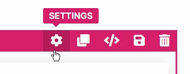
Top Margin
The Top Margin setting allows you to control the space between the current element and the element directly above it. If no previous element exists, the margin will be applied relative to the parent container, such as a row, section, or flex container. You can adjust the margin using the slider or manually input a value (px or percentage %), ensuring the spacing is consistent with your design needs.
Filters
The Filters settings allow you to control which products are displayed:
Filter by Bump: Determine how bump products are displayed:
.png)
Display All: Shows all products, including both bump and non-bump products.
Show Only Bump Products: Displays only products marked as bump products.
Show Non-Bump Products: Displays only products that are not marked as bump products.
Filter by Collection: Enable this option to display products from a specific collection. When selected, you can choose the desired collection to filter the displayed products.
.png)
Note
When you select Current Collection Name, the element dynamically updates to display products from the specific collection the user is currently viewing.
Collection Settings
The Collection Settings let you configure how your products are displayed on the page: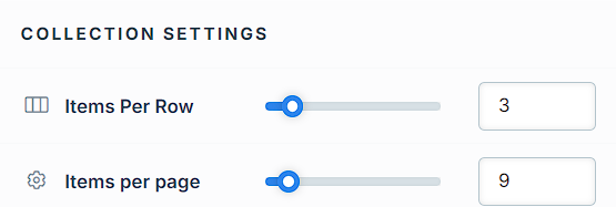
Items Per Row: Choose how many products to display per row.
Items Per Page: Specify how many products are shown per page.
Pagination Customization: Pagination divides your product list into multiple pages, allowing customers to browse through smaller groups of items instead of scrolling through an extensive list. This helps improve navigation, load times, and the overall user experience. You can customize its appearance to suit your design:
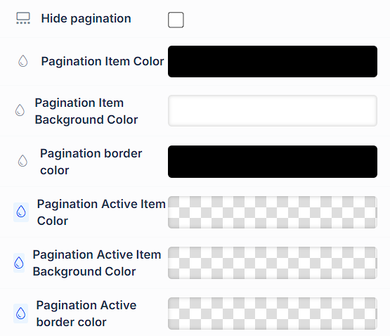
Hide Pagination: Enable or disable pagination for multi-page product collections.
Pagination Item Color: Set the color for pagination items.
Pagination Item Background Color: Define the background color for pagination items.
Pagination Border Color: Customize the border color for pagination items.
Pagination Active Item Color: Set the color for the currently active pagination item.
Pagination Active Item Background Color: Adjust the background color for the active item.
Pagination Active Border Color: Customize the border color for the active item.
Advanced Settings
To further customize your container (section, row, column, and element), ClickFunnels provides powerful Advanced settings options that allow you to control style, advanced CSS, animation, and rendering logic. We’ve separated these advanced features into dedicated articles to avoid overwhelming you with too much content in one place and to keep our documentation concise. Explore the following resources for more details:
Advanced Settings - Customize Styles: Learn how to populate contents dynamically, position containers, and apply z-index.
Advanced Settings - Customize Animation: Learn how to add animations, control entry and exit effects, and adjust animation delay.
Advanced Settings - Customize Logic: Learn how to apply conditional logic to elements and add custom attributes.
Control Panel
The Element Control Panel appears at the bottom of every element in the page editor, offering quick access to essential settings and actions for that element. Here’s what each icon represents:.png)
ALL: The element will be visible on all devices (desktop, tablet, and mobile).
Desktop Icon: The element will only be visible on the desktop view.
Mobile Icon: The element will only be visible on mobile view.
Eye Icon: Use this to hide the element from the page. The element will still be present in the editor but invisible to visitors.
Code Icon: This icon opens the code editor, where you can insert custom CSS or JavaScript code to modify the element's behavior or styling.
Trash Icon: Removes the element from the page editor entirely.