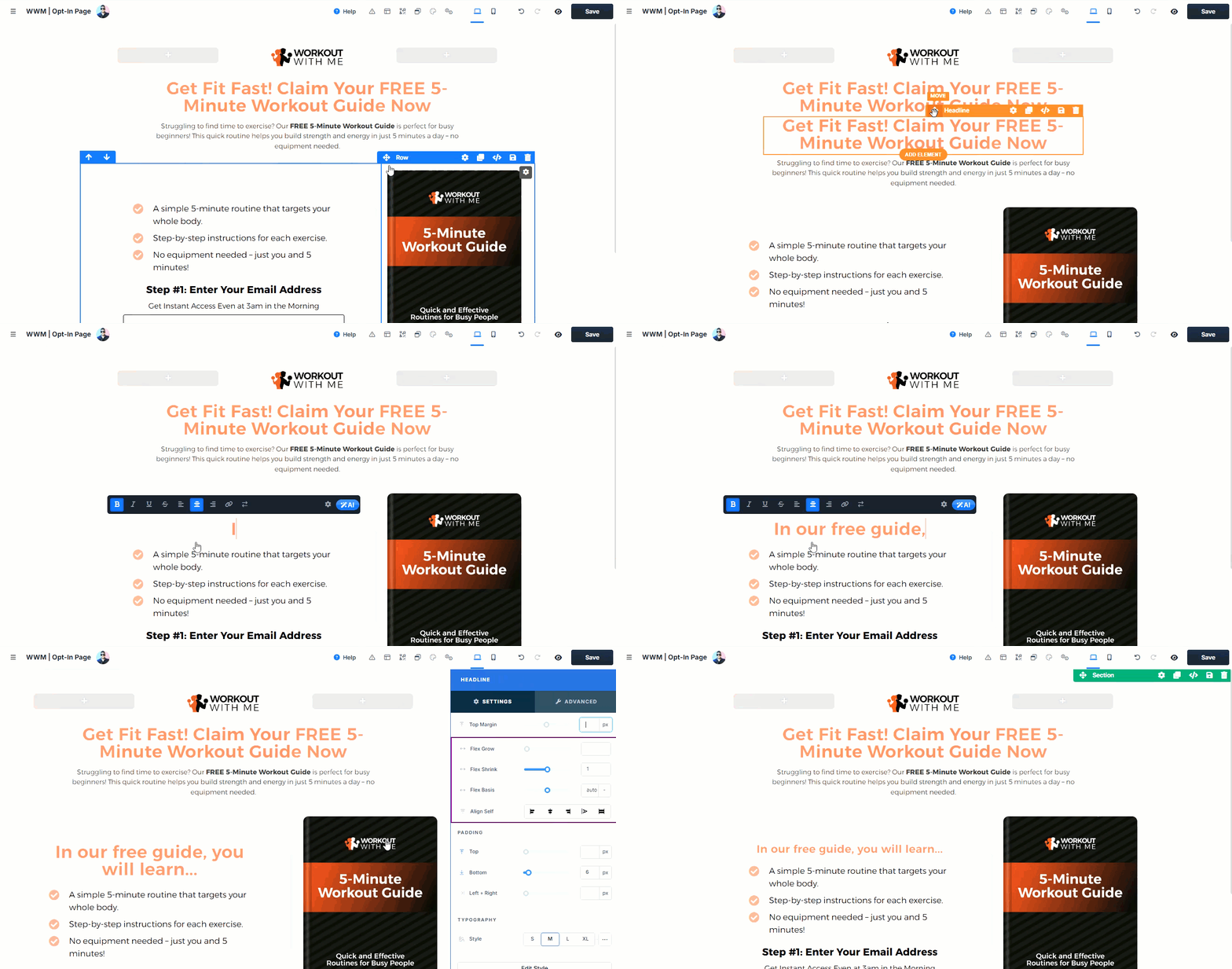
The ClickFunnels Editor is a versatile tool that lets you design and customize pages for funnels, stores, sites, blogs, and courses. With its intuitive drag-and-drop interface, you can easily structure pages using sections, rows, and elements. In this article, we'll explore the editor’s core features and guide you on how to build effective, visually appealing pages across all your ClickFunnels assets.
Requirements
An active ClickFunnels account.
A page created in your workspace.
Top Navigation Bar
The top navigation bar provides quick access to essential tools:.png)
Page Name: The page name is displayed on the top left, making it easy to identify which page you are currently editing.
Profile Icon: In ClickFunnels, you can see who is actively editing the page. If multiple team members or collaborators are working on the page simultaneously, their profile icons appear next to the page title, facilitating collaboration and helping to prevent conflicting edits.
Help: The Help button opens a support widget directly on the page. ClickFunnels provides AI-powered assistance, enabling you to ask questions about funnel building, ClickFunnels features, or account issues with immediate and accurate responses. You can also contact support directly from the help widget. Learn how to contact support in the Contacting ClickFunnels Customer Support article.
Info: The Info tab provides crucial guidance and alerts to ensure smooth editing and saving of your page. It highlights any issues that require attention by turning red and indicating errors or warnings. For example, if you add a text area input element but fail to set an input type or provide a custom type name, the Info tab will notify you of this oversight. Clicking on the tab displays detailed messages about the specific issues, helping you address them promptly and avoid potential errors in your page design.
.png)
Layout: The Layout tab allows you to structure your page by organizing sections, rows, columns, and elements. In the ClickFunnels Editor, a section acts as the primary container, with rows placed inside each section and elements added within rows to build content. As you add multiple sections, your page may grow longer, making it challenging to locate specific content. The Layout tab provides a clear view of each section, row, and element’s position within the page, helping you navigate your layout efficiently. By assigning names to sections, rows, and elements, you can easily identify and manage them. Simply click the Layout tab, locate the item you wish to adjust, and drag it to your desired position to reorganize your page without directly editing each piece of content.
.png)
My Assets: The My Assets tab provides access to all previously saved sections, including universal sections and pre-made sections from ClickFunnels. You can use the search feature within My Assets to locate any saved section you need for your page quickly. Learn more about saving sections and rows as templates in the How to Save Sections and Rows as Template article.
Popup: Each page can include one popup. To view or edit the popup, click on the Popup menu and select Show Popup. You can add content, adjust the design, and modify styles by choosing Edit Settings, which opens a settings panel where you can adjust various properties of the popup modal. Learn more about editing and managing a popup in the page editor in the Adding a Popup article.
Style Guide: The Style Guide tab links your page to a global style. It opens the linked style in a popup modal, allowing you to edit the global style directly from within the page editor without needing to exit it. To learn more about creating and managing a global style in your ClickFunnels workspace, visit the Getting Started with Styles article.
Settings: The Settings menu offers several customization options for your page, including background, typography, and code additions.
Background: This option allows you to set a background for the entire page, similar to applying a background style to the HTML
<body>tag. You can upload an image or select a color for the background. Options include adjusting Image Style (such as filling the full width of the page) and Image Fit (alignment within the page). You can also toggle between background colors or add a video as the background for dynamic visual impact. Learn more in the Adding Background Image and Video to the Page article.Typography: This option lets you customize font settings for your page. You can select the Content Font type, adjust the Weight (such as Regular or Bold), and specify colors for Text and Links. The Content Font setting in the Typography section allows you to choose the primary font used for the main text on your page. This includes the body text, headings, and other written content elements, ensuring a consistent look and feel across the page.
Show Code: The Show Code option opens the code editor, where you can add custom CSS or JavaScript. This allows for more advanced customization, enabling you to adjust styling and add functionality beyond the default editor settings. Learn more in the Adding Custom CSS Code for Custom Design and Adding Javascript Code for Advanced Feature articles.
Editor Settings: This section contains additional settings for managing how elements respond to user interactions:
Element Hover Timer: This tool adjusts the delay time before an element reacts when hovered over.
Hover Intent Sensitivity: Controls the sensitivity of hover detection of elements.
Nested Collections: This option allows you to insert a collection element inside another collection element. You can learn more about the Collection Elements in the Layout Your Section Using Collection Elements article.
Note:
Nested Collections is not recommended for live pages; they are still under development.
Desktop View: The Desktop View icon indicates elements or features viewed on desktop devices.
Mobile View: The Mobile View icon signifies elements or features viewed on mobile devices.
Undo: The Undo icon allows you to reverse the previous action, restoring the design to its state before the change was made.
Redo: The Redo icon enables you to reapply the previously undone action, restoring the design to its state after the undo operation.
Preview: The Preview icon lets you preview your designs in real-time, showing viewers how the final output will appear.
Save: The Save icon allows you to save your work and changes, ensuring that modifications are preserved and can be accessed later. Learn more about saving and previewing your page editing in the Page Editor: Saving and Previewing Your Work article.
Creating Layouts with Sections, Rows, and Elements
In the ClickFunnels Editor, creating page layouts involves a hierarchy of containers - sections, Rows, and Elements—each serving a specific role in organizing content on your page.
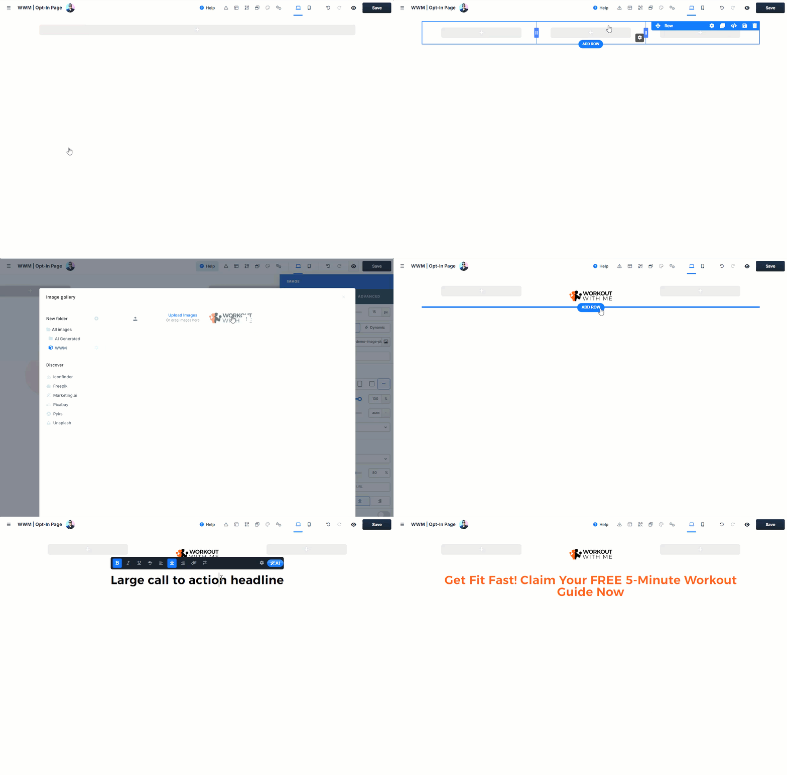 Adding a Section
Sections are the top-level containers (Labeled as Green)and serve as the primary layout blocks on your page. Each section can contain multiple rows, which hold elements for your content.
To add a section, click the Add Section button, choose the desired layout width (full-width, wide, medium, etc.), and place it where you need it on the page. Sections are the "parent" containers, and rows and elements within them are the "child" components. Learn details about adding a section in the Page Editor: Adding Sections article.
Adding a Row
Rows are added within sections (Labeled as Blue) to further structure your content. Rows contain columns, which help organize elements horizontally. You can add multiple rows to each section, stacking them vertically for a structured layout.
To add a row, click Add Row within the section and select the desired column layout ( e.g., single column, two columns, etc., up to 6 columns). This allows you to customize how content is distributed within each section. Learn details about adding a row in the Page Editor: Adding Rows article.
Adding Elements
Elements are the individual content pieces (Labeled as Orange), such as text, images, buttons, and inputs, that make up your page. Elements are placed within rows, providing the final layer of customization for your page layout.
To add an element, click Add Element within a row and choose the type of content you want to add. Elements are the "children" of rows, completing the hierarchy. Learn details about adding an element in the Page Editor: Adding Elements article.
Hierarchy of Containers
The hierarchy in the ClickFunnels Editor follows a structured layout to maintain consistency and ease of editing:
Sections are the highest-level container.
Within each Section, you can add Rows (with multiple columns).
Inside each column in a Row, you can place Elements.
Nested Layouts
In addition to the standard hierarchy, ClickFunnels also supports Nested Layouts to create complex, flexible designs within your page. Nested Rows allow you to add multiple column structures within a single row or column, providing additional layers of customization for your layout. For example, if you start with a two-column row layout, you can add a nested three-column row within the right column. This creates a multi-layered layout where the right column now holds its own set of columns, called nested rows.
When you add a nested row in ClickFunnels, the editor automatically creates a new section to wrap around this nested content. This section acts as a container for the nested row, ensuring that all elements and layout adjustments within this structure are organized and contained separately. Learn more in the Nested Rows: Created Nested Layout Using Nested Rows article.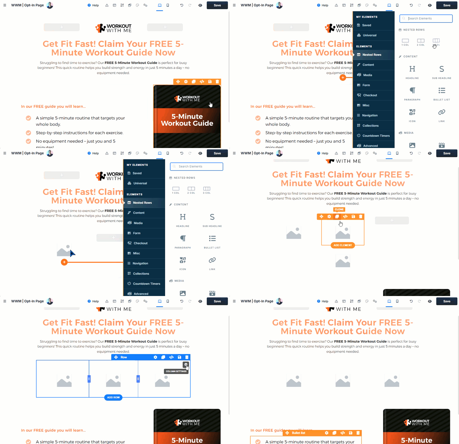
Understanding Block Elements
The Block Elements widget in the ClickFunnels Editor provides a variety of pre-built elements organized by categories, making it easy to find the right components for your page. When you try to add an element inside a container, such as a row or flex container, this widget appears from the right side of the page. This widget includes everything from basic content elements to advanced options, allowing you to customize your page to meet specific goals..png)
You can explore elements by category to suit different needs. For example:
Content elements include headlines, paragraphs, lists, icons, etc, to communicate your message.
Form elements let you collect information from visitors.
Checkout elements allow you to add payment options for collecting orders directly on the page.
Select the category that aligns with your needs, such as Checkout for payment processing, and drag the element onto your page. This library of block elements ensures you have the flexibility to build and customize pages effectively, tailored to your funnel’s purpose.
Accessing Settings
In the ClickFunnels Editor, you can easily access settings for sections, rows, columns, and elements by clicking the gear 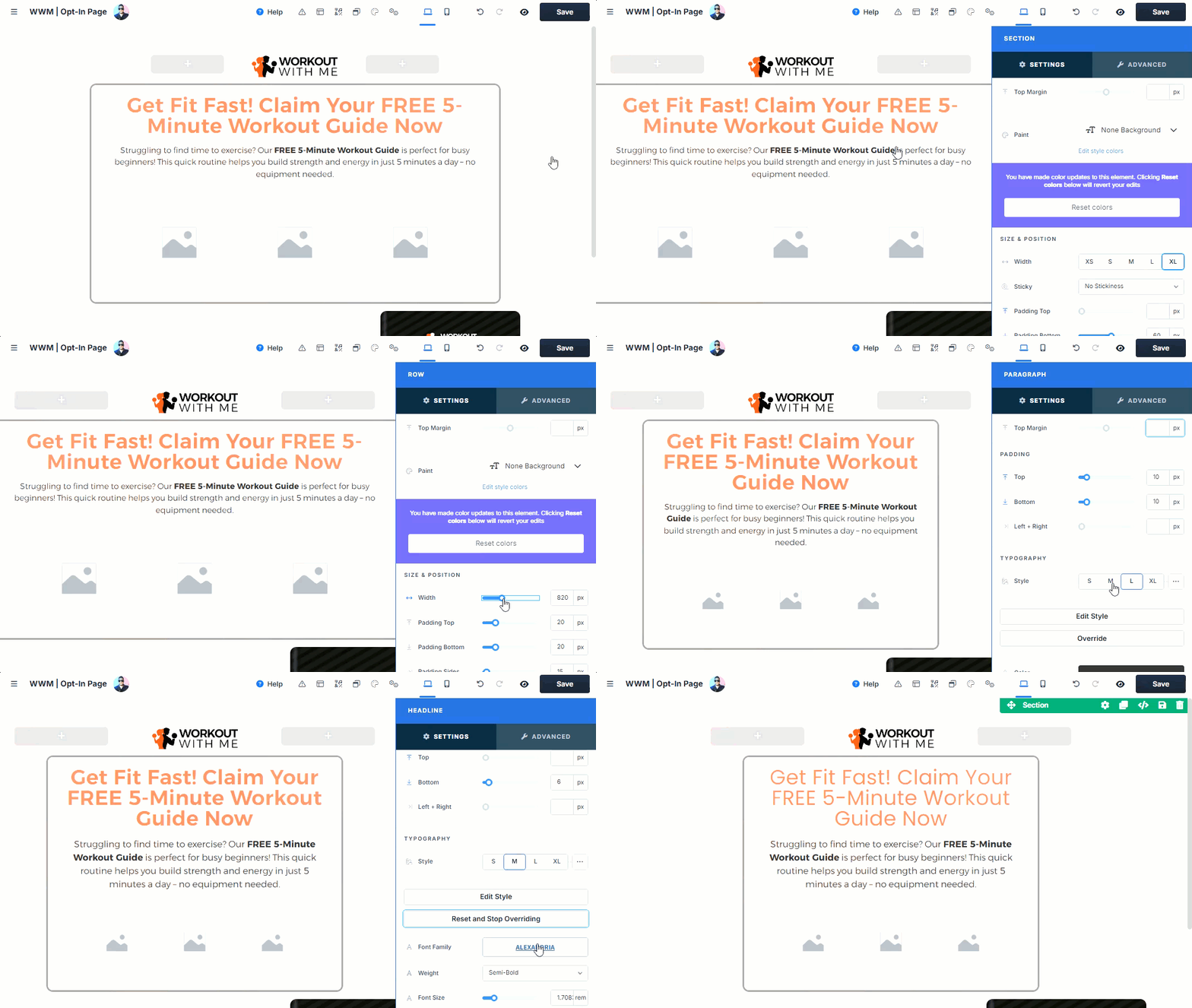
Cloning Content
The ClickFunnels Editor makes it easy to duplicate content, helping you design pages quickly and efficiently. You can clone entire sections, rows, and individual elements with a simple click. Once duplicated, you can drag and drop these cloned items to different positions on the page, enabling you to build layouts faster while maintaining consistency across your design.
Saving Section/Row/Element as Template for Reuse
ClickFunnels allows you to save sections, rows, and elements directly in the editor, making it easy to reuse content across your pages. Once saved, these components are stored in your saved gallery, where you can import them into the same page or any other page within your workspace. This feature lets you quickly build consistent designs across multiple pages without needing to recreate elements from scratch, streamlining your workflow and saving time.
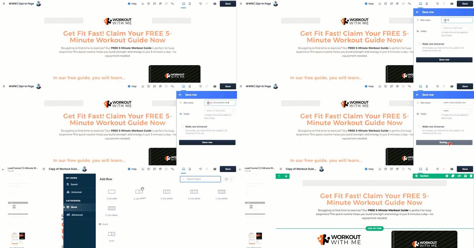
Universal Section/Row/Elements: Sync Changes Across Pages
In addition to regular saved content, ClickFunnels also allows you to save sections, rows, and elements as Universal Content. For example, you can save a row as a Universal Row. When you use a universal section across multiple pages in your workspace, any changes made to that section will automatically update across all pages where it’s used. This is incredibly useful for maintaining consistency on elements like headers, footers, or other frequently reused sections..png)
This feature simplifies updates, as you only need to edit content in one place to see changes reflected everywhere. For more information on setting up Universal Sections, check out our detailed article Adding a Universal Section.
